


New Zealand has a healthy democracy, boasting 3.2 million enrolled voters in 2017. However, there were key demographics, namely Youth, Māori and Pasifika, where engagement was lower.
Research showed that while the Electoral Commission (EC) and “Orange Guy” were synonymous with voting, the brand felt distant and unrelatable for these priority audiences.
We needed a design system that could build on the well-established aspects of the brand, while bringing in more inclusivity, impartiality and celebration of the democratic process, with a distinctly New Zealand sensibility.
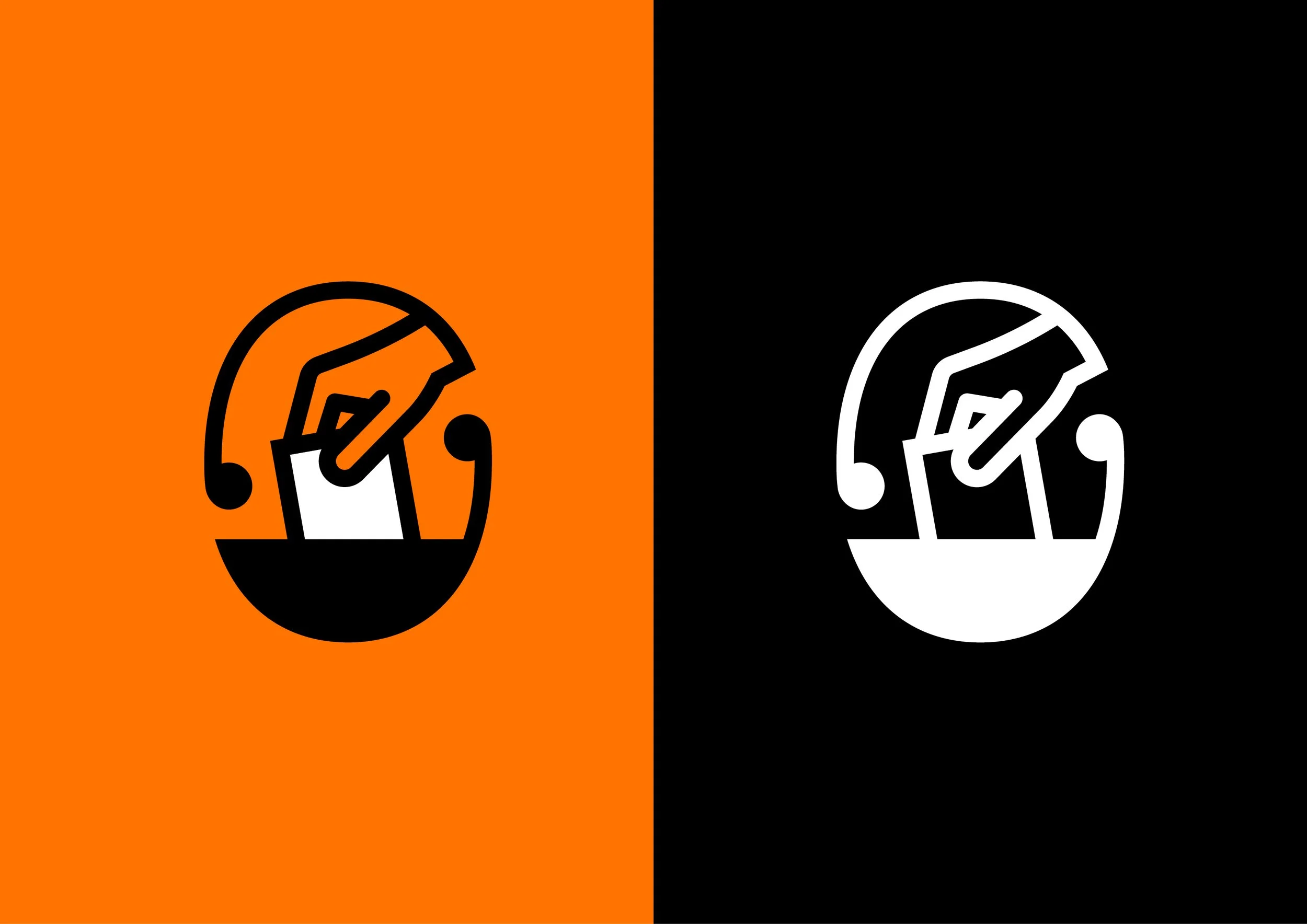
In the logo, we introduced a new element – our Kaitiaki Tohu. The ballot-in-hand represented the physical act of voting, and our encircling Kaitiaki Tohu represented the role of the EC as the guardians of our right to do so.
Orange remained our key brand colour, occupying an important non-partisan role. The tone was refined to be more vibrant and engaging, and we introduced complementary colours to broaden the palette. This demonstrated inclusion and was a significant enough shift to provoke reappraisal with our key priority audiences. The palette sprung to life in a dynamic gradient device, a key linking element across thousands of visual assets, and acted as the basis for a newly expressive abstract world for Orange Guy to do his work.
OG was contemporised, and we also introduced a sidekick, ‘Pup’, to bring more joy and engagement to our comms, acting as a foil for our lead character.
This campaign contributed to New Zealand’s largest pre-election turnout. Advance votes increased by almost 60% compared to 2016, and just under 2 million votes were cast before election day. Turnout was the highest since 1999, at 82.2%, and enrolment was 94.1%.